The Letterforms That Refuse to Retire: Inside the Quiet Revival of Jikji-Inspired Typography
Walk through the studio of any number of American type designers in 2025 and you may notice something unexpected pinned to the wall: not a Swiss poster, not a Bauhaus grid, but a photograph of a page from a 14th-century Korean Buddhist text. The reference is deliberate. As audiences grow weary of interchangeable geometric sans-serifs, designers are mining Jikji's letterforms for something the market increasingly rewards—character with a history attached.
Why Medieval Hangul Reads as Modern
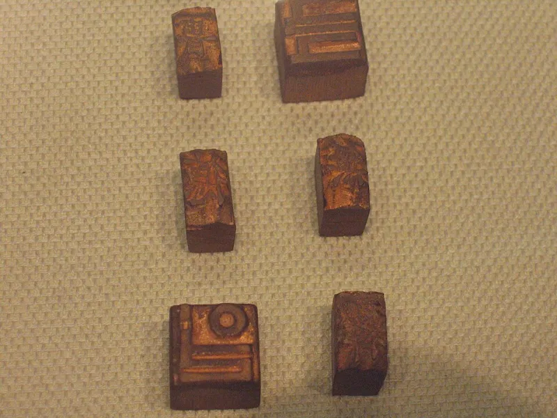
Jikji, printed in 1377 in Cheongju, contains movable metal type cut for Hangul-adjacent syllabic blocks at a moment when such type was revolutionary. The letterforms carry qualities that contemporary designers find magnetic: compact vertical rhythm, strokes that balance geometric precision with visible hand-cut irregularity, and a dense, woven texture on the page that photographs beautifully.
Portland-based type designer Marcus Ileri, whose foundry released a display face last spring modeled on early Korean metal type proportions, puts it plainly. "Clients kept asking for something that felt 'authentic' and 'human,' and I got tired of faking it with distressed textures. Jikji's type is the real thing. The imperfections are structural, not applied."
That authenticity matters commercially. Independent record labels have used these faces for liner notes and cover art; a recent A24-style prestige film trailer leaned on a Hangul-influenced display font for its title card; craft breweries and specialty coffee roasters—brands that trade heavily on provenance—have adopted the aesthetic for labels and packaging.
The Ethics of Borrowing a Heritage
The revival is not without friction. Designers working in this space are increasingly careful to distinguish appreciation from appropriation, and several foundries have partnered with Korean typographers and institutions rather than simply extracting forms.
The consensus among the designers we interviewed: credit the source, learn the history, and compensate Korean collaborators. A typeface is not just a set of shapes; it is a document of a culture's response to a communication technology. Treating it that way produces better work—and better relationships.
Practical Tips for Using Jikji-Inspired Typefaces
For designers and curious readers who want to experiment responsibly, our interviewees offered consistent guidance:
- Use display faces for display purposes. These letterforms carry heavy texture and detail. Set them large—titles, posters, chapter openers—and pair them with a quiet, legible text face for body copy.
- Respect the grid. Medieval Korean type was designed for vertical composition and tight syllable blocks. Even in horizontal English settings, generous line spacing and restrained letter spacing honor the original rhythm.
- Verify licensing and attribution. Several foundries require or request acknowledgment of Jikji's historical source. Read the license the way you would read a museum label.
- Learn before you launch. Ten minutes reading about Jikji and early Korean printing will sharpen your design decisions and give you language to explain the work to clients.
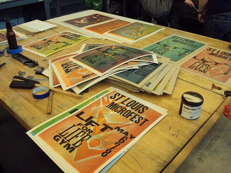
- Print it if you can. These forms were cut for metal and paper. A letterpress proof or even a heavy uncoated digital stock brings out qualities a screen flattens.
A Legacy That Keeps Working
At the Jikji Museum, we believe the world's earliest extant book printed with movable metal type is not only an artifact to preserve but a living resource. Every time a designer in Brooklyn or Portland studies those letterforms and casts something new, the 1377 argument—that technology should serve language beautifully—gets made again.
The font that speaks, it turns out, never stopped talking. It was simply waiting for the rest of us to listen.