Lost in Translation: The Stubborn Digital Mystery of Medieval Korean Metal Type
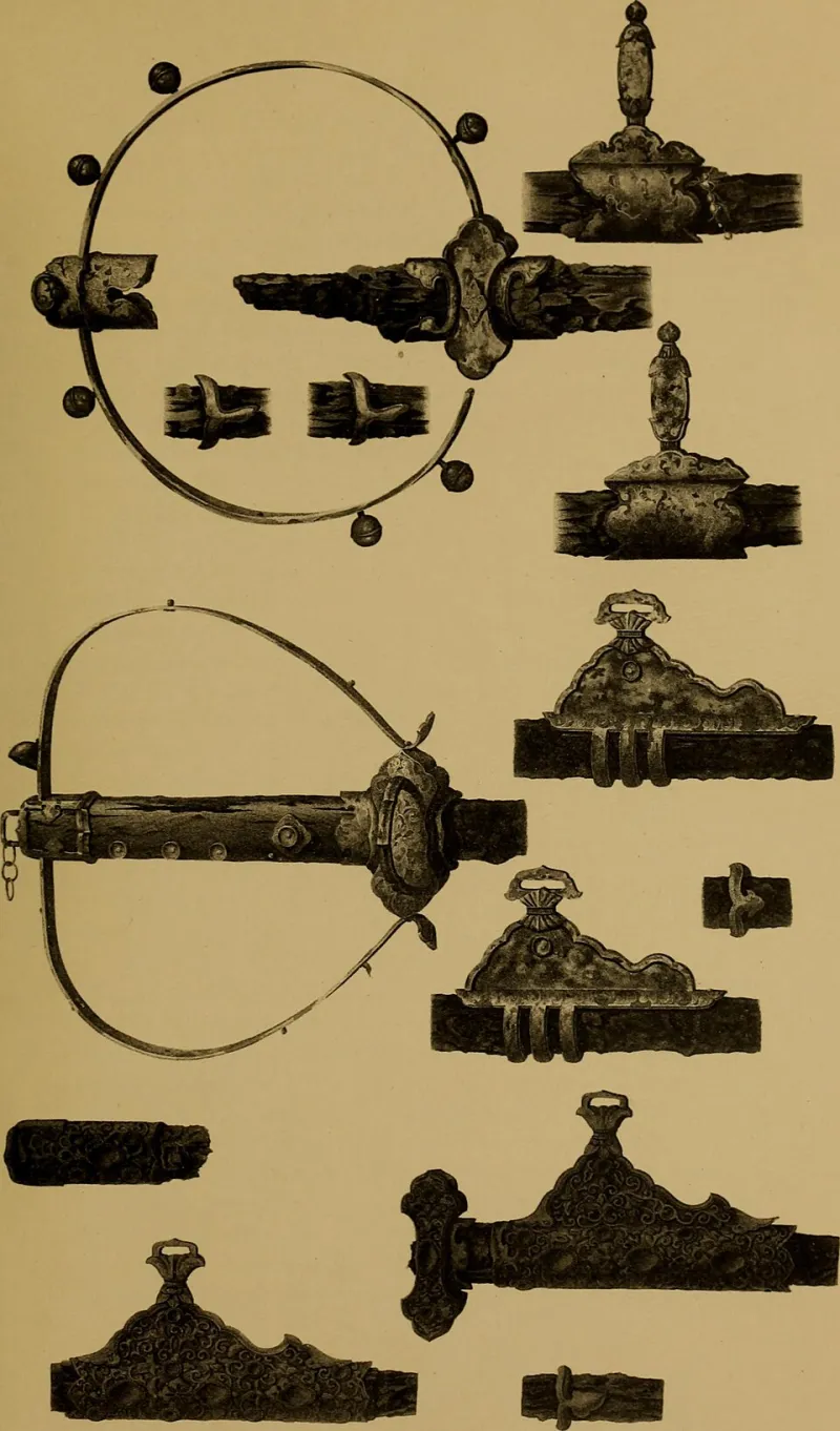
Photo: Gowland, William, 1842-1922; Japan Society of London, No restrictions, via Wikimedia Commons
There is a particular kind of frustration familiar to anyone who has spent time trying to render a medieval Korean text on a modern screen. The characters look approximately right. The spacing seems reasonable. Yet something essential has been lost — a quality that scholars and designers alike struggle to name precisely, let alone reproduce. For the typographers, archivists, and cultural technologists working at the intersection of Korean printing history and digital design, that unnamed quality has become one of the most intellectually demanding problems in the field.
At the center of this challenge sits Jikji — the 1377 Buddhist anthology widely recognized as the oldest surviving text produced using movable metal type — and the centuries of Korean metalworking tradition that made it possible. The characters pressed into its pages were not drawn; they were cast, filed, and inked by hands working within a craft tradition that no longer exists in its original form. Reproducing those characters digitally is not simply a matter of scanning and scaling. It is, as several practitioners have discovered, closer to an act of archaeological interpretation.
Why Metal Type Is Not What a Scanner Sees
The fundamental difficulty begins with the physical nature of the original objects. Korean metal type from the Goryeo and early Joseon periods was cast in bronze using methods that introduced subtle, irreproducible variation into each individual piece. The surface of a single character block was rarely perfectly flat. Ink did not coat it uniformly. When pressed to paper — itself a material with its own texture and absorbency — the resulting impression carried a kind of controlled imperfection that gave the text its visual warmth.
Digital scanning, even at extremely high resolution, captures what the eye sees on the page. It does not capture the mechanical logic behind what produced that impression. A high-fidelity scan of a Jikji page records ink on paper. It does not record the angle of the press, the viscosity of the ink at the moment of contact, or the microscopic compression of the paper fibers beneath the type. All of those variables contributed to the final visual result, and all of them are invisible to the scanner.
For designers working to build usable digital typefaces from this material, the gap between what can be measured and what needs to be understood is considerable.
The Problem of the Irregular Baseline
One of the most technically vexing characteristics of historical Korean metal type is what designers refer to as baseline irregularity — the way individual characters in a printed line sit at slightly different vertical positions relative to one another. In contemporary digital typography, consistent baseline alignment is a foundational principle. Software enforces it automatically. Readers expect it.
In 15th-century Korean printing, that consistency was aspirational rather than guaranteed. Variations in the casting process, wear on individual type pieces, and the manual assembly of each line meant that characters within a single column of text could shift subtly up or down. To a modern eye trained on digital text, this reads as error. To a scholar familiar with the period, it is a signature — a mark of authenticity and craft that carries historical meaning.
Replicating this quality digitally presents a genuine dilemma. A typeface that artificially introduces baseline variation risks looking like a simulation of imperfection rather than an honest representation of historical practice. One that eliminates the variation entirely produces something technically cleaner but historically misleading — a version of the past that never actually existed.
Several American typographers working on East Asian historical fonts have grappled with this tension directly. The consensus, where one exists, tends toward restraint: document the variation thoroughly, but resist the temptation to encode it as a permanent feature of a digital font. The irregularity belongs to specific printed objects, not to the type system that produced them.
Cultural Knowledge That Cannot Be Digitized
Beyond the technical obstacles lies a deeper problem, one that touches on the limits of what archival technology can preserve. The craftspeople who produced Korean metal type in the 14th and 15th centuries carried knowledge that was transmitted through practice, apprenticeship, and embodied skill. That knowledge was not written down in any systematic way. Much of it did not survive.
Contemporary efforts to reconstruct historical Korean type design therefore rely heavily on inference — working backward from surviving printed pages to hypothesize what the original type must have looked like, how it must have been made, and what aesthetic principles guided the craftspeople who made it. This is legitimate scholarly work, but it is also inherently incomplete. Every digital reconstruction of historical Korean type is, at some level, a best-informed guess.
For institutions like Jikji Museum, this incompleteness is not a reason for paralysis but for transparency. Digital representations of historical Korean type should be accompanied by clear documentation of what is known, what is inferred, and where the limits of current knowledge lie. Presenting a digital typeface as a faithful reproduction of 15th-century Korean metalwork, without acknowledging the interpretive choices embedded in its design, would be a disservice to the historical record.
What American Institutions Are Doing About It
Across the United States, a small number of academic programs and museum-affiliated research projects have begun addressing these challenges with increasing seriousness. University libraries with significant East Asian collections have started collaborating with type design programs to develop methodologically rigorous approaches to historical Korean font reconstruction. The work is slow, painstaking, and often underfunded — but it is advancing.
Some of the most promising efforts have moved away from purely visual analysis toward a more multidisciplinary approach. Materials scientists, historians of technology, and professional type designers are working together to understand not just what historical Korean type looked like, but how it was physically produced. Experimental casting projects, using period-appropriate alloys and techniques, have generated new hypotheses about the relationship between manufacturing method and visual output.
These collaborations have also produced a broader appreciation for why the problem matters beyond academic circles. Digital text is how most Americans will ever encounter Korean printing history. If the typefaces used to display that history are technically inaccurate or aesthetically misleading, then the public understanding of a world-historical achievement is being shaped by a distortion. The stakes of getting this right extend well beyond the design community.
A Living Problem Without a Clean Resolution
The typefaces used to display Jikji and related Korean historical texts online today remain imperfect instruments. They are better than they were a decade ago, and they will likely improve further as research methods and digital tools continue to develop. But the fundamental challenge — translating a material, craft-based tradition into a format designed for screens — is unlikely to be fully resolved.
What can be resolved is the quality of the conversation around that challenge. When designers, archivists, historians, and institutions are honest about what they know and what they are guessing, when they document their interpretive choices and make that documentation available to the public, the imperfection of the result becomes informative rather than simply inadequate.
Jikji survived centuries of war, neglect, and institutional indifference to reach us. The least we can offer in return is the intellectual honesty to represent it as faithfully as our tools allow — and to be clear about where those tools fall short.