Cast in Silence: The Forgotten Aesthetics of Korean Metal Type and Their Quiet Return to Modern Design

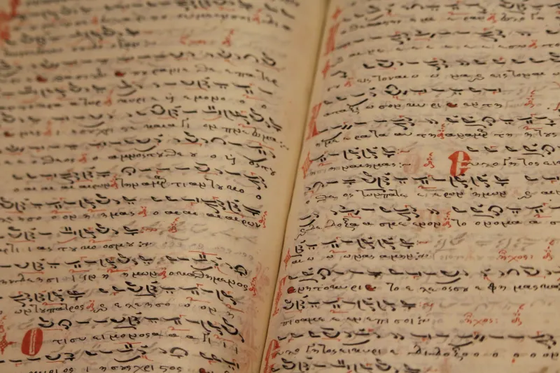
Photo: ancient Korean metal movable type printing blocks close-up, via img.freepik.com
When design historians trace the lineage of modern typography, the story almost invariably begins in a German goldsmith's workshop in the mid-fifteenth century. Johannes Gutenberg's movable metal type is treated as the origin point — the moment from which all subsequent visual language descended. Yet that narrative omits an entire civilization's worth of innovation, one that predates Gutenberg by roughly seven decades and produced letterforms of remarkable complexity and beauty. The metal type used to print Jikji in 1377 was not merely a technical achievement; it was a visual one. And its near-total absence from Western typography education represents one of the more consequential gaps in how design history has been taught and understood in the United States.
What Made Jikji-Era Type Distinctive
The characters cast for Korean metal type printing during the Goryeo and early Joseon periods were not simple stamps pressed into ink. They emerged from a sophisticated understanding of how letterforms behave under pressure, how ink distributes across a surface, and how the eye moves across a page. Hanja characters — the logographic script used in scholarly and religious texts of the period — demanded an exceptionally high degree of precision. Each character required individual casting, and the craftsmen who produced them developed methods for achieving consistency across thousands of unique glyphs.
The resulting typefaces had a particular visual quality: a density of stroke, a calibrated balance between thick and thin lines, and a spatial rhythm across the printed page that reflected both calligraphic tradition and the constraints of metal production. Scholars who have examined surviving examples closely note that the type used in Jikji demonstrates an awareness of optical spacing — the subtle adjustments that make text feel visually even even when it is not mechanically uniform. This is a principle that Western typography would not formally articulate for centuries.
How Western Design History Erased a Parallel Tradition
The exclusion of Korean typographic achievement from Western design curricula was not accidental. It followed from a broader pattern in which European intellectual traditions were treated as universal and self-sufficient, while non-Western innovations were categorized as curiosities rather than contributions. When Western scholars and printers encountered East Asian printing during the colonial era, they frequently acknowledged its existence while simultaneously framing it as technologically inferior or aesthetically alien — a framing that served specific ideological purposes and that persisted well into the twentieth century.
The consequences for design education in the United States have been significant. Graphic design programs at American universities and art schools have historically organized their history courses around a Eurocentric timeline, moving from Gutenberg through the Industrial Revolution to modernism and digital typography. Korean printing innovation — when mentioned at all — appears as a footnote, a curiosity to be acknowledged before returning to the main narrative. Students graduate with sophisticated knowledge of Helvetica's origins and Bodoni's proportions, but little awareness that a parallel and equally rigorous typographic tradition existed and flourished in East Asia centuries before European type design reached maturity.
What Designers Are Rediscovering
In recent years, a quiet but meaningful shift has begun. A new generation of type designers — many of them Korean American or trained in programs with stronger Asian design history components — has started examining Jikji-era letterforms not as historical artifacts but as active sources of design intelligence. What they are finding challenges several assumptions embedded in Western typographic orthodoxy.
The stroke modulation in historical Korean metal type, for instance, reflects an approach to contrast that differs fundamentally from the axis-based logic that governs most Latin typefaces. Where Western type design has historically organized thick and thin strokes around a diagonal or vertical stress axis derived from calligraphic tradition, Korean metal type distributes contrast in ways that respond to the structural logic of the characters themselves. This produces a visual rhythm that contemporary designers are finding both unfamiliar and instructive.
Several independent type foundries in the United States have begun releasing typefaces that draw explicitly on Goryeo and Joseon-era printing aesthetics. These are not historical reconstructions but contemporary designs informed by historical principles — an approach that mirrors how European type designers have long engaged with Renaissance and Baroque letterforms. The difference is that this conversation is happening largely outside mainstream design discourse, in small publications, academic conferences, and online communities rather than in the pages of major design journals.
The Role Museums Can Play
Institutions dedicated to the preservation and interpretation of printing heritage have a particular responsibility in this moment. Museums are not passive repositories; they are active shapers of historical narrative. When a museum presents Jikji alongside Gutenberg's Bible as parallel achievements rather than as a footnote to a European story, it changes how visitors understand the history of human communication. When educational programs developed by those museums reach design students and working professionals, they can begin to shift the assumptions embedded in professional practice.
At Jikji Museum, the commitment to preserving and sharing knowledge about historical printing heritage extends explicitly to the typographic dimension of that heritage. The visual character of Jikji-era type — its proportions, its weight distribution, its relationship to the written forms that preceded it — is as much a part of the artifact's significance as its date of production or its technical method. Communicating that significance to American audiences requires moving beyond the typical framing of "oldest" or "first" and engaging with what these letterforms actually look like, how they were made, and what they can teach contemporary designers.
Reintegrating Korean Type History Into Design Education
The practical question of how to reintegrate Korean typographic heritage into American design education is one that a growing number of educators are beginning to take seriously. Some have proposed dedicated modules within existing history of graphic design courses. Others argue for a more fundamental restructuring of how design history is taught — one that abandons the Eurocentric timeline altogether in favor of a genuinely global account of how human beings have developed systems for recording and transmitting knowledge visually.
Design schools that have partnered with cultural institutions holding significant East Asian collections report that access to primary materials — even in digital form — changes the nature of the conversation. When students can examine high-resolution images of Jikji-era type rather than reading descriptions of it, the aesthetic dimension becomes concrete and discussable in ways that abstract historical narrative cannot achieve.
The typefaces cast in Korea in the fourteenth century were not waiting to be discovered by Western designers. They were always present, always significant, always part of the human story of how ideas are given visible form. What has been missing is not the evidence but the willingness to look at it clearly — and the institutional structures that make such looking possible. That willingness is growing, and the institutions that support it are doing work that matters not only for historical completeness but for the vitality of design as a living practice.